Luke - Travel Website
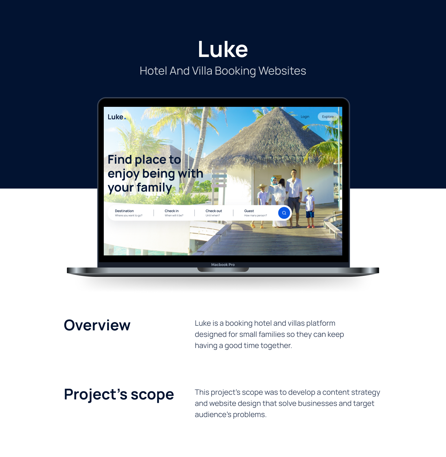


Luke - Designing a Seamless Booking Experience for Families
Luke is a hotel and villa booking platform thoughtfully designed to help busy families find and book their perfect getaway, ensuring they spend less time planning and more time creating memories. This case study outlines the journey of transforming a concept into a user-centric and visually engaging website.
Project Overview
The internet is filled with booking platforms, but many are cluttered and overwhelming, causing friction for users who already have limited time. The goal for Luke was to cut through the noise and create a streamlined, intuitive, and inspiring website specifically for families. The project's scope involved developing a complete content strategy and a user interface design that directly addresses the pain points of the target audience.
The Challenge
Modern parents are often juggling demanding careers and family life. When it comes to planning a vacation, they face several common frustrations:
- Decision Fatigue: Too many options and complex interfaces make it hard to choose a destination.
- Time-Consuming Process: The booking process itself is often lengthy and complicated.
- Lack of Inspiration: Families often fall back on the same vacation spots because finding new, suitable destinations is a challenge.
- Uncertainty: A lack of clear, comprehensive information about properties leads to a poor customer experience.
Our challenge was to design a platform that alleviates these frustrations and makes trip planning an exciting, effortless experience.
Understanding the User
To ground our design in real-world needs, we developed a user persona: John Foaray.
John is a 38-year-old civil engineer, married with three children. His demanding job means his family time is precious. He wants to make the most of his days off but is frustrated by the typical online booking experience.
John's Needs:
- An effortless way to book hotels and villas.
- Suggestions for great, family-friendly destinations.
John's Pain Points:
- Previous bad experiences with online bookings.
- Difficulty finding new and exciting places to visit.
- The lack of destination suggestions after a booking is made.

John's persona became our guide, ensuring every design decision was made with his needs and frustrations in mind.
The Process
We followed a structured four-step design process to ensure a thoughtful and effective outcome:
- Understand: We began by deeply understanding the business goals and the user's core problems. This involved analyzing the market and defining John's journey.
- Content Strategy: Next, we built a strategy for the website's content, focusing on what information would bring the most value to users like John. This included planning for inspirational travel guides and clear, concise property details.
- Design: This phase brought the vision to life, starting with foundational wireframes, establishing a visual identity, and culminating in high-fidelity mockups and prototypes.
- Handoff: Finally, all design assets, including a comprehensive design system, were organized and delivered to the development team for implementation.
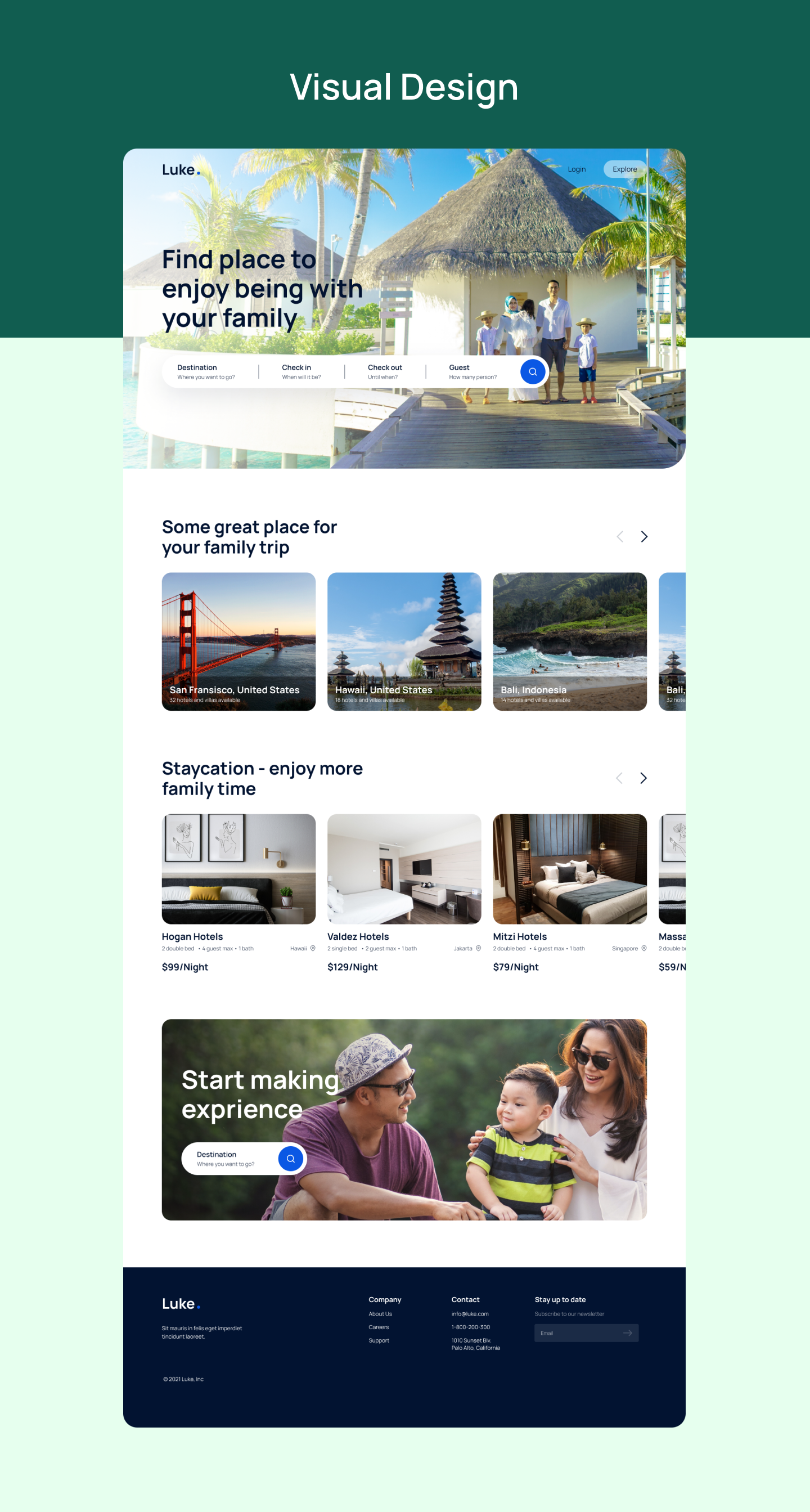
The Solution: Crafting the Experience
Our solution was a clean, modern, and intuitive website that guides the user seamlessly from inspiration to booking.
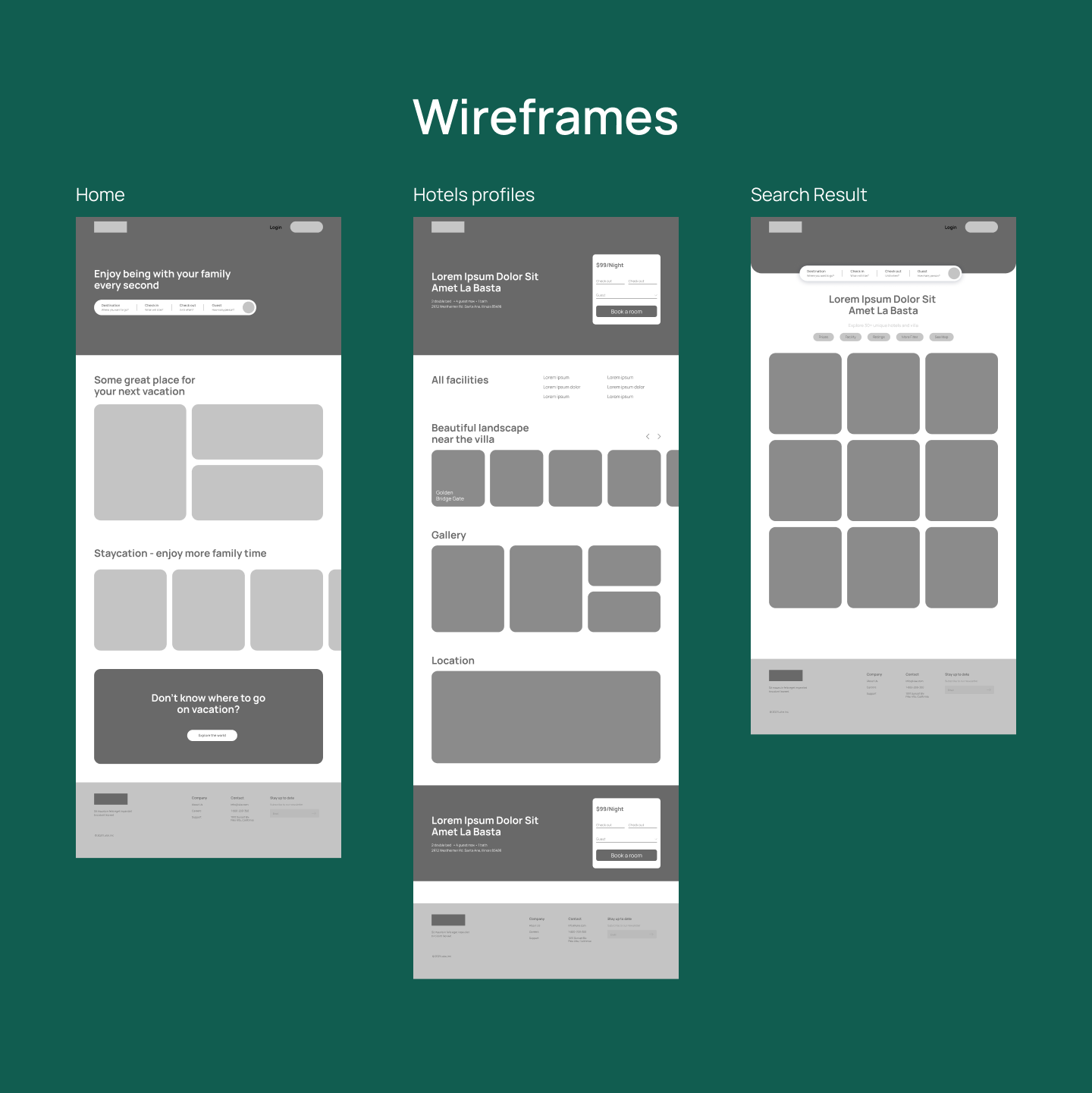
1. Wireframes
We started with low-fidelity wireframes to establish the core structure and layout of key pages: the Homepage, Search Results, and Hotel Profiles. This skeletal framework allowed us to focus on user flow and information hierarchy without the distraction of visual elements, ensuring the foundation of the site was logical and easy to navigate.
2. Colors & Typography
With the structure in place, we built a design system to ensure visual consistency and create a welcoming feel.
- Colors: The palette is led by a deep, trustworthy blue (
#021331) and a vibrant, energetic blue (#0B58E4) to inspire confidence and excitement. These are balanced with clean white and calm grey to maintain a modern and uncluttered aesthetic. - Typography: We chose Manrope, a clean and highly readable sans-serif font. A clear typographic scale was established to create a strong visual hierarchy, making content easy to scan and digest.

3. Final Visual Design
The wireframes and design system came together in the final high-fidelity mockups, where the solutions to John's problems truly shine.
- Homepage: The first impression is one of inspiration and simplicity. A prominent search bar invites immediate action, while curated sections like "Some great place for your family trip" and "Staycation" directly address John's need for travel ideas.
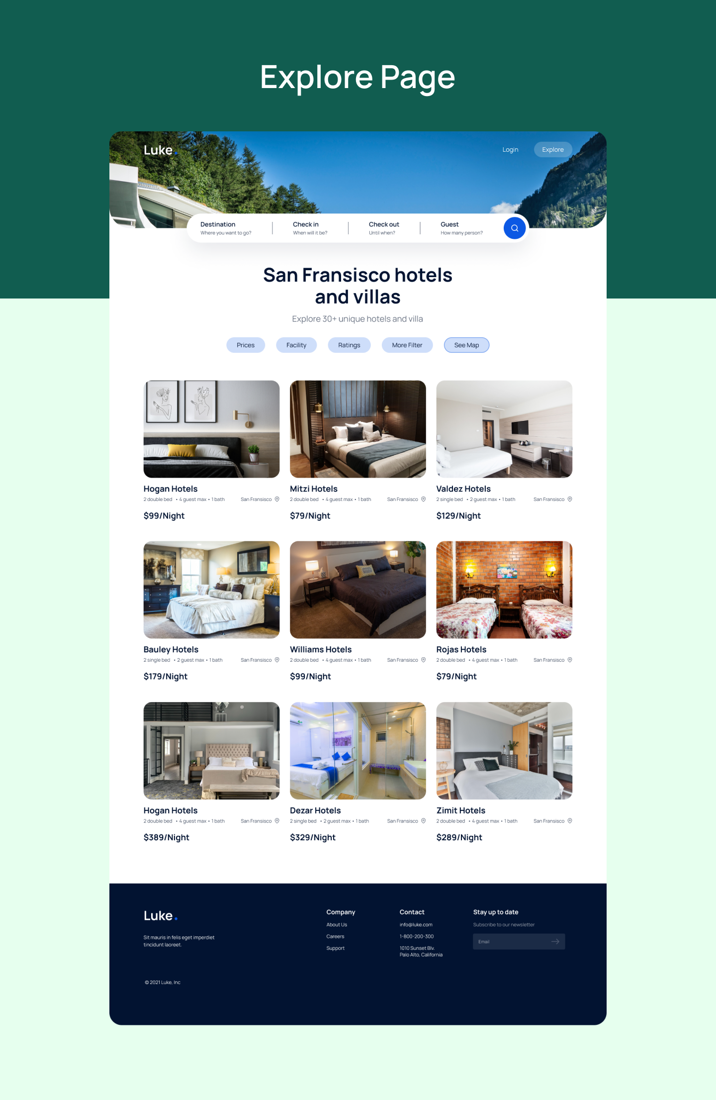
- Explore Page: This page presents search results in a clean, card-based grid. Key information like price and hotel name is instantly visible. Intuitive filters allow users to easily narrow down options without feeling overwhelmed, making the selection process efficient and stress-free.
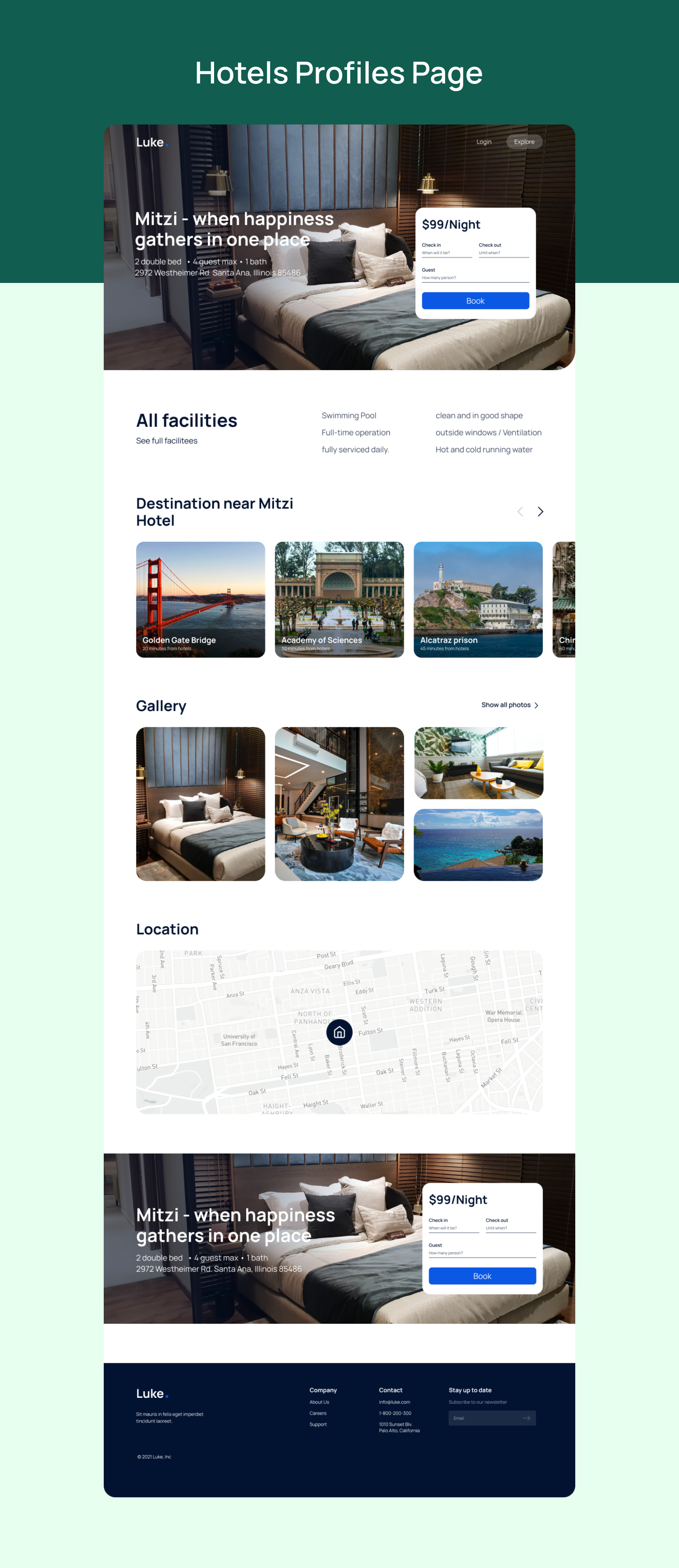
- Hotel Profile Page: The property page provides a comprehensive overview to help families make informed decisions. It features a gallery, a detailed list of facilities, a map, and suggestions for nearby destinations—all organized into clear, scannable sections. The booking widget is always accessible, making it simple to finalize a reservation.
Homepage
Explore
Hotel Profile
Conclusion
By focusing on the specific needs of a busy family man like John, we designed Luke, a booking platform that is more than just a utility—it's a partner in planning family adventures. The final design is clean, inspiring, and highly functional, directly solving the user's pain points of complexity and lack of inspiration. Luke empowers families to discover new destinations and book their stays with confidence and ease, turning the often-stressful task of trip planning into an exciting first step of their journey.